


Under the framework of:

Sponsors:


Today it's all about icons and stereotypes about the elderly. Yes, I also wanted to echo the controversy unleashed by the unfortunate graphic designer of Antena 3 Noticias last Saturday 27 February with his icon of a bent person with a cane to refer to people over 55. It doesn't matter that during the last week the anecdote has been covered by highly visible media. Everyone has come to praise the elegance with which the presenter of this news programme, the legendary Matías Prats, apologised for his teammate's mistake by using himself as an example of a 71-year-old who does not see himself represented by the icon in question. Some have even tried to make an exercise in responsibility by warning of the social stigma behind the use of this icon. My post is different because it comes, as is becoming customary, to create a bit of discord. I focus more on practicality than on the social component of things. It happens to me with the language used to refer to the elderly and it happens to me now with icons. I am beginning to think about and question the meaning of these debates on ageism, just to take nothing for granted, to form my own opinion and, ideally, to help others who are as lost as I am to do the same.
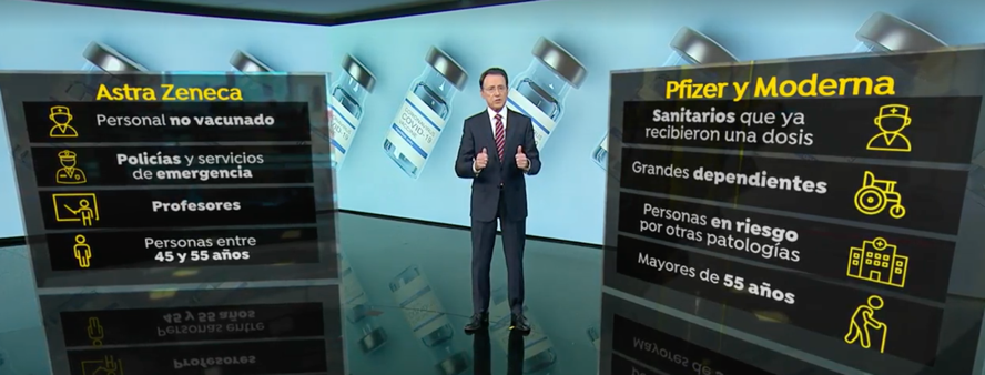
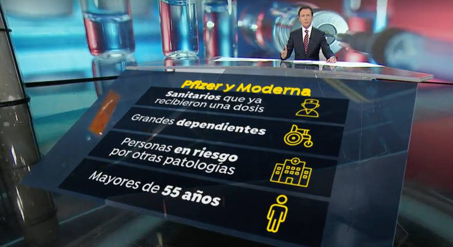
For those who have read this far and don't know what the issue is about, I will spend a few lines on the background of the case. At around 15:08 on the aforementioned day, the famous communicator explained the vaccination plan against the coronavirus in Spain using the tables shown in the following image.
Of course, Prats did not notice for a moment the last icon of the one to his right (he himself acknowledged this later); the important thing was to understand which age groups the vaccines from Astra Zeneca, Pfizer and Moderna were aimed at. But as he was showered with criticism on the social networks (I could not be 100% sure, but I would say that it all started with a tweet by the politician and jurist Ignasi Guardans), not so much directed at him directly as at the Atresmedia group in general, in the evening's delivery he tried to appease those who had felt offended by the use of this icon. Thus, with his characteristic light-hearted yet rigorous tone, towards the end of the programme he said:
"Look at this icon; it refers to the 55+ age group, where I am. A bit of an exaggeration, isn't it? Carlos, our graphic artist, is 55. I don't know what he expects when he turns 56. The fact is, we already know where he's coming from. It's a bad thing, it seems. But we won't hold it against him. We've forgiven him for the moment.
I can imagine Prats' anguish on Saturday afternoon when he realised what was coming his way, devising all sorts of rhetorical devices with which to rectify the situation in the most subtle way in the following hours, without leaving Carlos in a bad place (he must have been suffering), who surely chose the icon with the best of intentions so that it would be different from the one selected for the 45 to 55 year-old segment in the Astra Zeneca slide, and without harming the communication group to which they both belong. As always, he managed to get off the hook and, moreover, received a round of applause. Matías Prats rarely disappoints. From that moment on, every time the image of the vaccination plan is shown on the screen (and it appears a lot, because the news is repeated a lot throughout the days), it can be seen that the demonic icon has been replaced by the one that traditionally refers to the "person" without any other attributes.
This could also lead to dissatisfaction on the part of others, because the icon does not necessarily represent everyone over the age of 55. In other words, it is not completely inclusive; to be on the safe side, they could have used an icon with two subjects, one wearing trousers and the other wearing a skirt, as is typical. But there are also those who would object to this assimilation of gender and clothing. That is a different matter. I am fine with the rectification icon; I think it represents the group of "human beings".
Back to the topic. Among the many reactions to the use of Carlos's icon on Twitter that Saturday afternoon, three main lines of opinion stood out. About 60% were complaints from anonymous commentators over the age of 55 who did not feel represented by the icon. Approximately 30% were complaints from experts who went a step further, claiming that the icon was ageist, enabling and homogenising, no matter what age it was used, as not all older people walk around with their heads up and require the help of a walking stick to be able to stand on their feet. Finally, the remaining 10% were messages from people who said they did not understand why such an upheaval was taking place over an unimportant icon. The truth is that I immediately identified with the latter group. I could understand the lamentations of the over-55s, but not the demands of the well-versed. Here we go again," I thought, "people are so focused on the tiniest details, it's like discriminatory language! But no, it's not exactly the same. It is rather more complicated.
The philosopher of language and mathematician Gottlob Frege said that the reference of the signs we use to communicate was determined by the meaning we speakers gave to them. Thus, "old" and "old person" are two signs that refer to the same reality, but they are not similar (they are not entirely synonymous) because, arguably, they have different meanings in our society: the former has a negative connotation and is used in a derogatory sense to refer to the people in question, while the latter has a positive connotation and is used in a respectful sense towards them. This is where I believe that if we re-signify these "offensive" signs it will not be necessary to eliminate them, a much more difficult task to achieve, it seems to me. What the label composed of the letters v-i-e-j-o means depends on the meaning we give it, it has no meaning by itself. It is somewhere between re-signifying the word and banishing it from the vocabulary.
Now, the sign "icon of the gibbous individual with a cane" does not seem to be able to be re-signified. The explicit image does not allow it, it prevents us from imagining those to whom it refers as anything other than fragile, sick, damaged, even deformed beings, in need of help even to walk. We can still give the word "old" a different meaning by making the phenomenon of ageing in its maximum heterogeneity valid. It is a question of educating the new generations in the idea that old, elderly or old are different signs to refer to those who are in the last natural stage of life (because that is how it is, whether we like it or not) with all the good (and bad) that this entails. But the graphics... Oh, the graphics! There is no way to fight it. A person who is ill-fitted and has difficulty walking shows that he or she is in an undesirable situation of functional eviction, even though each person represented by this icon is valuable in himself or herself in countless aspects. But if this particular icon is not used to refer to the elderly, what will be used to differentiate them from the rest, and what is the objective of achieving this differentiation? Why are the 20-year-olds not distinguished from the 50-year-olds?
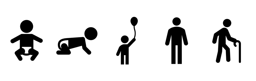
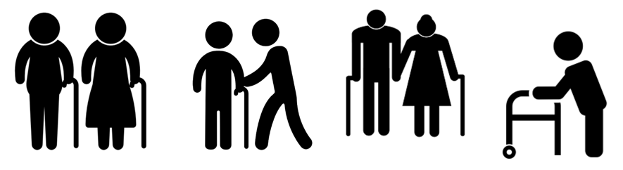
Icon comes from the Byzantine Greek eikón and means, according to the RAE, "sign that maintains a relationship of similarity with the object represented". Vector icons, like the one used by Carlos, are two-dimensional pictograms that come to represent a reality, simplifying it in order to make it easily identifiable at a glance. Each stage of reality that makes up human physical development has its icon: first we are babies who are just being in the world, then infants who crawl, then happy children who play, then we become adults, and finally we grab the cane and wait for the end of the cycle. Of course, not all children are happy and playful and not all adults walk leaning on a crutch.
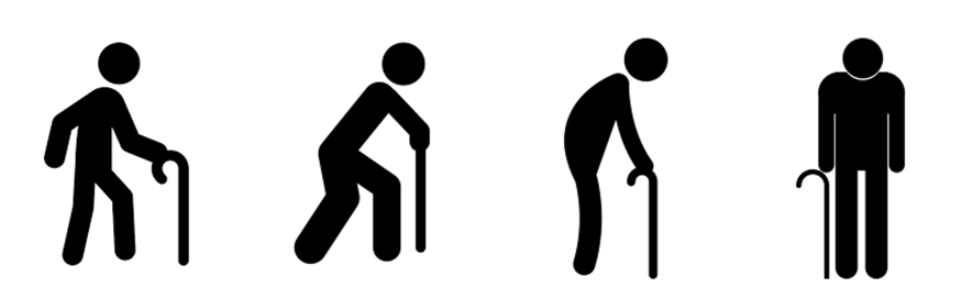
Older people have been depicted with the icon of the bent, almost neckless, supported dummy for decades. This visual sign changes slightly in each creative line, but the essential elements are always the same: curvature of the back and the need for a cane. Sometimes the protagonist is in movement, sometimes standing, sometimes sitting (always with his support, even in the most unexpected places); sometimes it is a solitary subject, sometimes accompanied, sometimes a couple holding hands. And to allude to a very, very old person, the cane is replaced by a walking frame.
The designer can be minimalist or detailed, try to introduce cultural traits or make explicit the pain that accompanies old age. But there are always the two key features: cane and hump.
We see them on the bus, on the metro and on the train, in waiting rooms, in sections of shops, near escalators and lifts, in recreational areas in public gardens, in places where elderly people pass through, in advertisements for products (trips for retired people, orthopaedic articles, health material...), in the news and even on the doors of the toilets in some retirement homes. He is everywhere, this stranger who is not me, with whom I do not identify.
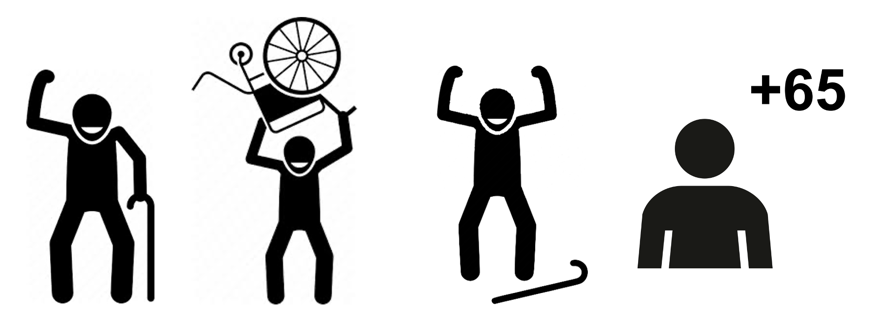
Is there no other way to represent older adults through something more positive? The word processor I am using to write this article says there is not. And the length of time this sign has been used confirms the negative. It seems that this is the best we have come up with. Or maybe we have never cared as much as we do now, because in the past being old was not synonymous with human waste in the collective imagination of a few. Or because we had not realised the damage done to the elderly by this stereotypical representation that takes as a common element of old age the traits that make only some people dependent.
With the appearance of emoticons, we have improved a little. The cane has been exchanged for grey hair, glasses, baldness and wrinkles; things that are all considered negative, but are they really? Or, again, is the problem in how we understand and deal with the ageing process?
Is it a negative thing to lose functionality as we age, or is it a part of life to be accepted as such? Even the most painted person suffers from the aches and pains of old age sooner or later, with a few exceptions. At what age would you feel comfortable using these emoticons? My father has been wrinkled since he was 50. My maternal grandmother died at 92 without a single wrinkle. Glasses have known none. The one has grey hair and the other had grey hair. It is clear that we are not going to find an icon that will please everyone. Nor does the one used to refer to disability represent all disabled people (or, rather, all differently abled people). Not all women wear skirts and not all men wear trousers. But we understand the sign and it serves a function precisely because it homogenises the reality of a whole age group, or even several age groups, for a practical purpose. We can't think of anything better, because there's nothing wrong with being older, or being hunched over with age, or carrying a cane; it's no worse than not needing one. Even if we use for all adults, no matter how old they are, the classic icon of the subject without attributes, we will all be the same, homogeneous, identical. This is not real either. The positive side of ageing cannot be represented graphically, because it has less to do with the physical than with the spiritual. Maybe the problem lies in separating the positive from the negative, instead of considering both aspects as inseparable parts of the whole. I don't know.
Can you, the readers, think of a solution (if there is a problem) and what do you think of these alternatives? For me, the latest one, developed by Ceapat and the LideA Forum in 2017, and with the possibility of variations it includes, has won me over. I promise I will soon stop rambling and return to boredom.